Introduction
Cryptocurrency investors are aware that they should not use the market as gambling rings and base their decisions on qualified trading methods. To this end, Candlestick Charts can help investors in getting familiar with how the market works.
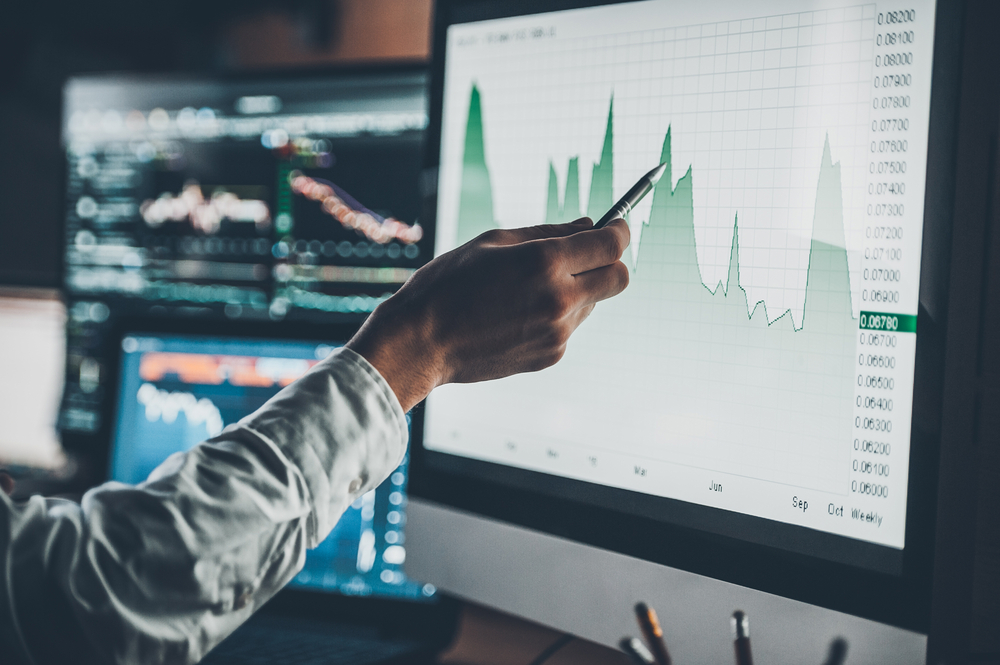
Candlestick Charts are a window into the price movement of assets on a regular basis that is free from manipulation and misinterpretations. This article is going to teach investors how to use candlestick charts to get read market movements.
What is a Candlestick Chart?
Data engineers and financial experts have devised many unique methods of rendering data in image form. These charts or visualization of data nodes help the investors to understand the market dynamics in one glance.
In the same manner, Candlestick Charts are another type of data chart that help analysts make sense of the market movement on the basis of prices. Candlestick charts, as visible by their name, represent the price movements of assets in the form of candle tickers.
Each candle ticker is based on four basic parameters that can tell the whole story of price movement for an asset in one glance. These four foundational factors are opening, closing, highs, and lows based on price readings. It is important to note that Candlestick charts take a specified time frame for the investors to create these candle tickers.
For example, one full candlestick formation is based on the price movements happening in one day. For cryptocurrencies, candlestick wicks update every 24 hours or based on intraday price fluctuations.
How do Candlestick Charts Work?
Cryptocurrency investors who are familiar with blockchain are in a better position to understand Candlestick charts. Just like on-chain data can be extracted from a blockchain by its users, in the same manner, the investors can also gain free access to candlestick charts from services like cryptocurrency exchange or other crypto data aggregators.
Inherently, Candlestick charts are not manipulative, and they are free from the bias of calculations that comes with other technical indicators such as trading volume, circulatory supply, price trends etc.
Therefore, if investors can learn to read candlestick charts and use this data to read the market dynamics, they can get a clear picture of the market. Each candle in the chart is representative of the opening price for the day and the closing price.
Both these marks make the thick parts of the candle. On the other hand, the thin wick on each candle is made from day-high and day-low. Therefore, without needing to view any data figures, investors can look at a candlestick chart and instantly grasp all the major and minor changes happening in the market.
Origin of Candlestick Chart
Candlestick Chart is traced back to 18th Century Japan. According to historians, a rice trader hailing from Japan named Munehisa Homma first invented Candlestick charts.
He reportedly used the features of a candle to mark down the opening, closing, high, and low prices for rice per day. However, it has been adopted by trading firms like the Dutch East India Company and has transformed into its existing modern rendition.
Today, no technical market analysis is complete without Candlestick charts. Most cryptocurrency firms and exchanges provide real-time candlestick chart updates for their users free of cost, as it is considered the building block of technical analysis.
The Basic Structure of Candlestick Chart
Before moving on to advanced market analysis using Candlestick Charts, the investors must first take a look at the basic components of each candle in a candlestick chart. Here are all the important parts that investors should know:
Body of the Candle
The first thing that investors are bound to notice in a candlestick chart is every isolated candle. The thick body part is the most visible part of every price candle. This part is known as Candle Body. The body of the candle is thick, and it is made from closing and opening prices.
A bullish candle has a closing price on the upside and an opening price near the lower end. On the other hand, a bearish candle has an opening price on the upper side, and the closing price is on the lower end.
Wick or Shadow of Candle
In addition to the main body, every candle also contains a thin wick-like structure sticking out at both ends of the candle. It is called a wick or shadow. This thinner part is made up of the highest and lowest prices for the day or other specified trading periods. In a bullish candle, the lower price is adjacent to the opening price.
On the contrary, a bearish candle has lower prices near the closing point of the candle body. However, the upper wick always denotes the highest price, and the lower wick always indicates the lowest price for the given trading period.
Colour of Candle
Investors have noticed that there is a clear distinction in candles based on bullish and bearish nature. However, investors do not need to wreck their brains to find out whether each candle is bullish or bearish. This distinction has been made clear with the colour specifications.
When the candle is bullish, or the closing price is above the opening prices, it is depicted with a green colour. Meanwhile, when a candle is bearish with an opening price close to the high side, the candle assumes a red colour. Sometimes, bullish candles are also white.
16 Types of Candlestick Patterns Every Cryptocurrency Investor Should Know
Candlestick charts are used for measuring the bearish or bullish intent of the market trend. On the other hand, the same chart data can also be used to spot trend reversals. Here is a list of 16 Candlestick Chart patterns that every investor should add to their analytical arsenal and learn to recognize:
Hammer Pattern
Hammer Pattern appears when the candle body is short, and the shadow is much longer. This pattern is usually present at the lowest point of a bearish trend. This pattern indicates that the bulls resisted the selling pressure and retained their crypto assets, and managed to recover the declining prices.
However, a hammer pattern can also be green or bullish. When this happens, it is seen as a forecast for a price recovery.
Reverse Hammer
Reverse Hammer is the antithesis of the hammer pattern. It can be distinguished on account of its long upper wick in comparison to its smaller candle body.
Therefore, it indicates the buying pressure has kept increasing despite the attempts of bears to pull the prices down. In usual cases, the inverse hammer is green, and it is seen as a strong uptrend signal.
Bullish Engulfing
It is a very popular candlestick pattern. This is a combination of two candlesticks. The first candlestick is short and has a red body. This shorter red candle is engulfed by a long green candle. The green and second candles open lower in comparison to the red candle. It represents that buying pressure is increasing, and it is also a sign of reversing a downtrend. Therefore, it is named a bullish engulfing.
Bearish Engulfing
It is very much like bullish engulfing, but only its reverse. It is also a candle pair where the first candle is green, and it is engulfed by a red candle next to it. The red candle is longer, and the opening price of the red candle is lower than the green one.
This pattern usually appears at the peak of an uptrend, such as ATHs. This is a clear indicator of a possible trend reversal towards a downtrend. The lower end of the second candle often indicates the momentum potential of a bearish trend.
Piercing Line
The piercing Line pattern is also a pair of candlesticks. This pattern usually emerges at the height of a downtrend. Its position is typically closer to the support level. The first candle is long and red, and it is followed by a long and green candle.
The distinct feature of this candle pattern is the visible distance between the closing price of the red candle and the opening price of the green candle. Since a green candle opens with a much higher price, it indicates an increase in buying pressure.
Morning Star
The Morning Star pattern is a complex system that contains a group of candles. It is usually made of three candles, with the first one being long red, the second being short red, and the third being long green.
The middle candle is isolated, and it does not have any overlaps with either longer candle in this pattern. It shows that the selling pressure has started to wane, and a bull market is underway.
Evening Star
This pattern is the reverse of the Morning Star pattern. This pattern also contains three candles, where the middle small green candle is followed by a long green and next to a long red candle.
The middle candle is short-bodied, and it shows that the buying pressure has started to wane while the bear market is arriving.
Three White Soldiers
As visible by its name, this pattern consists of 3 candlesticks. Each candle is green and long, and the shadows for each are very small in comparison to their long green bodies. These three candles are also present in an ascending manner, rising up consistently.
Each green candle has an opening and closing higher than the previous one. It is a strong bullish signal, and it usually appears at the peak of the bear market.
Three Black Crows
Three Black Crows are the reciprocal of Three White Soldiers. This pattern is a descending set of three long red candles. The shadows for all these three red candles are microscopic. Each new red candle opens at almost identical price points.
However, the closing points keep getting steeper and steeper for each. This is interpreted as a strong downtrend sign.
Hanging Man
Aesthetically speaking, Hanging Man looks very much like the hammer pattern. However, it is inversed. It can be either red or green candlestick with a very short body and a very long lower shadow. It is usually present at the end of a fully matured uptrend.
It signals massive selling pressure where bulls were able to retain the prices for a while and eventually lost control of the market.
Shooting Star
Shooting Start is viewed as the inverse formation of the inverted hammer. It is often a red candle with a short body and a very long upper shadow. It is formed when the market has opened and closed above the peak price. The body of the Shooting Star pattern, in some cases, is often invisible or minuscule.
Dark Cloud Cover
The dark Cloud Cover pattern is seen as a bearish reversal. It also consists of two consequent candles. The second one is a red that opens higher in comparison to its previous green candle and closes midpoint in reference to it.
This red candle indicates the struggle of the bears to take back control of the market that has pushed the prices lower. If the shadows for the candles in the Dark Cloud Cover pattern are short, the investors can anticipate a strong bearish correction.
Doji
Doji pattern is very uncommon, and it consists of two very small-bodied green and red candles consecutively. Both green and red candles have smaller bodies as well as very small shadows.
In most cases, this pattern can indicate a continuation; however, it also poses equal chances of trend reversals. When the Doji appears, investors wait for a few more candle prints to clear out confusion and ascertain the upcoming market direction.
Spinning Top
Just like Doji, the Spinning Top pattern is also made from a pair of two consequent red and green patterns. Both these patterns have small bodies, but the shadows are longer. The distinct feature of this pattern is that both red and green patterns have equal lengths of shadows.
This pattern is also an indication of relative stagnation and confusion in the market. It cans sometimes become synonymous with a trend consolidation in case of a recent sizeable price decrease.
Falling Three Methods
Falling Three Methods is a pattern that is made up of 5 candles. It is characterized by the continuation of a bearish price movement. The first pattern is a long red body that is followed by three green candles, and the last candle in the pattern is once again a long red one.
It is clear that all three green candles are surrounded by long, strong red candles. It is a power struggle between bulls and bears where the latter has dominated the markets.
Rising Three Methods
The Rising Three Method is the reversal of the falling three methods pattern. It starts with a long green candle followed by three small red candles that close with another long green candle at the end.
As already obvious, this pattern is where the bulls managed to exert their dominance, and it is a sign of strong uptrend consolidation.
How to Read a Candlestick Pattern
By paying attention to the factors, investors can learn to understand candlestick patterns better. At the same time, they can also improve their skills in using technical analytics:
Technical Indicators
There are some cases where despite a visible candlestick pattern formation, the market ends up moving in the opposite direction. Therefore, investors cannot depend on the readings from the popular candlestick patterns alone.
To increase the efficiency of their analysis, the investors use a combination of technical indicators to help them get more confirmations before proceeding to make a trading decision. Some of the most useful technical Indicators used in tandem with candlestick patterns are as under:
Time Frames
As per professional investors, the best way to take advantage of the candlestick patterns is to use them with bigger time frames. The lower time frame can track the smaller price changes, and they are not very useful for understanding the overall performance and direction of the marketplace.
Therefore, the investors should take bigger time references for candlestick pattern formation analysis.
Price Action
The price action of an asset can make a big impact on the direction of the market, such as support and resistance levels. As mentioned before, a hammer pattern is a visible sign of trend reversal.
However, it does not imply that the investors should dissolve their positions as soon as the hammer pattern makes an appearance in the marketplace. The most accurate patterns are those which are present within an ongoing price trend.
Therefore, investors must always reference candlestick patterns with support and resistance levels.
Stop-loss and Take Profit Points
Stop-loss is a breakpoint where the investors intend to dissolve their position to prevent losses. Investors can use candlestick pattern formations to identify the best stop-loss and profit takeout positions.
For example, using if there is a Hanging Man pattern near a critical support level, the investors can benefit by placing the stop-loss below it. In this manner, they would be able to take profits very close to the peak of resistance.
Understanding Terminologies
There are some useful terminologies and factors that the investors should take into consideration in addition to the support and resistance levels when working with candlestick patterns:
Impulse Price Movement
When the prices are under pressure from bullish or bearish-inducing fundamentals, the market can generate new highs and lows with rapid succession.
Correction Movement
When the price impulses are settled down, and the price enters into a correction phase, the movement can become slower.
Volatility
Certain assets like cryptocurrencies are considered as more volatile in comparison to stocks or commodities. Therefore, the price movement can break and repeat high and lows more frequently. However, it will not make a huge impact on the highly volatile assets.
Non-Volatility
There are also some circumstances where the prices of the assets become stagnant. Therefore, despite the aggressive highs and lows price oscillation the price dominance is going to remain solid movement for the best.
Conclusion
Candlestick patterns are very useful, and they are seen as the building blocks for technical analysis. Candlestick patterns are the first step in understanding the technical analysis of the assets such as cryptocurrencies.
However, investors should keep in mind that candlestick patterns work best when they are used in tandem with other options to recheck their results and projections.